The story behind the data
Data is the lifeblood of any organization or business, but understanding and using it effectively can be challenging. So how do we make sense of it all? How can we bring out the underlying meaning of complex data?
The answer is simple: storytelling. Storytelling allows us to take seemingly unrelated facts, figures, and statistics from our research or analysis projects and weave them into a narrative that communicates something meaningful about the topic. By using stories as an interpretive tool for understanding complex information sets, professionals can better explain their findings in a way that resonates with their audience – whether they’re clients or colleagues – without relying on overly technical explanations.

Here are some tips to get started with your story-driven approach to interpreting big datasets.
- Start by sorting your dataset into manageable chunks (categories or themes), so you don’t feel overwhelmed by its complexity. Sorting data into themes will help identify patterns or trends in your data which may not have been obvious, as well as any outliers or anomalies which may need further investigation or analysis.
- Consider using visualizations such as graphs, charts, or diagrams which allow for easy comparison between different variables – this means your audience doesn’t get overwhelmed with numbers but still gets an accurate picture of what they see presented before them. Furthermore, these visuals enable people who aren’t necessarily experts (such as non-technical stakeholders) to engage with the material better since everything has been simplified visually.
- It is important to identify patterns between different points within your dataset; this will help you recognize any correlations between variables which may have been previously overlooked. By looking at changes over time, we get a better picture as we start seeing relationships rather than just isolated snapshots from one moment alone; this helps us uncover deeper stories about our business operations
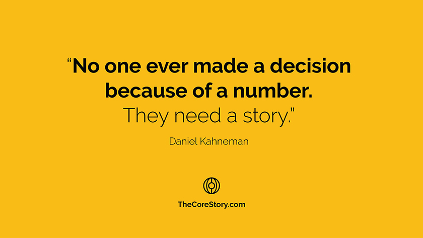
- Once these patterns have been identified, it becomes easier to develop storylines around each pattern which help illustrate why they exist in relation to one another (e.g., “This variable increases when this other variable decreases…why is this happening?”). Putting data together under narrative form helps explain why certain decisions were made or provides insight into how trends change over time; ultimately creating a compelling story around whatever topic being discussed. Stories are remembered up to 22 times more than facts alone. Neuroscientists have proved that decision-making is emotional. The data might inform us, but it is the story that influences us. With practice, anyone can become proficient at turning raw numbers into compelling stories.
It’s not the data itself but it’s the story that data tells you about your organisation that saves the big money. If you need help, please get in touch, and we’ll show you how to tell your data story.


